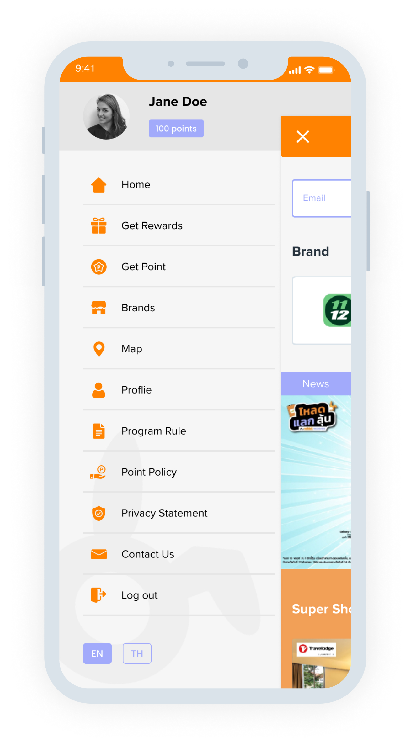
Propose redesign for all icons - Main menu, Hamburger, etc.
Redemption drawer - Adjust colors
Top bar
logo color > White
Use new logo (without box)
Remove Rabbit icon from points
Banner and designs on Slide 6 are probably too noisy to work for Facebook posts and image redemption images.
Don’t forget to adapt header and footer.
I divide it into two columns and break it up with a slideshow banner to clearly separate different sections. I add the partner logo to the top section.
From the customer behavior data I've received, users tend to look for products and services they want rather than scrolling endlessly.
From the user behavior data I've received, the first thing on the home screen is the search box, followed by partner logos section, three brands of promotions company want to promote,
and four expiring promotions sections. I also add a countdown timer and a outstanding background color to attract users.
I design according to the brand's colors. The boxes have rounded corners for a modern look. I put the point information on CTA so users can see it without having to navigate to another page, reducing complexity.
I use light grey as background colors that are easy on the eyes for users, so they spend more on the app.